Project Date
EARLY 2016
Role
Creative Direction, UX
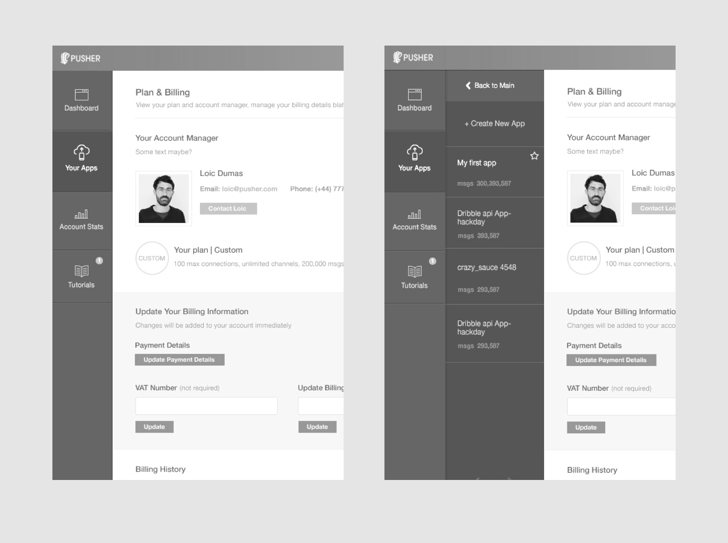
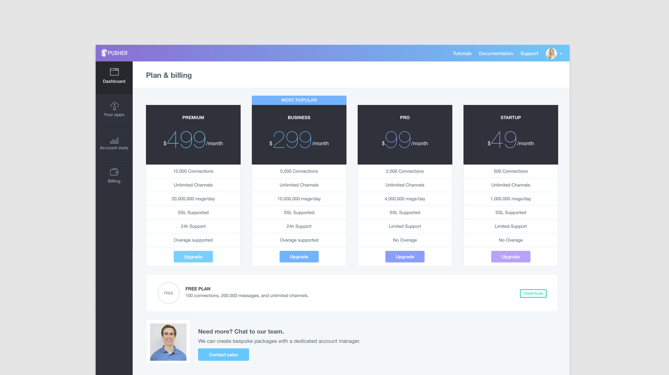
Dashboard
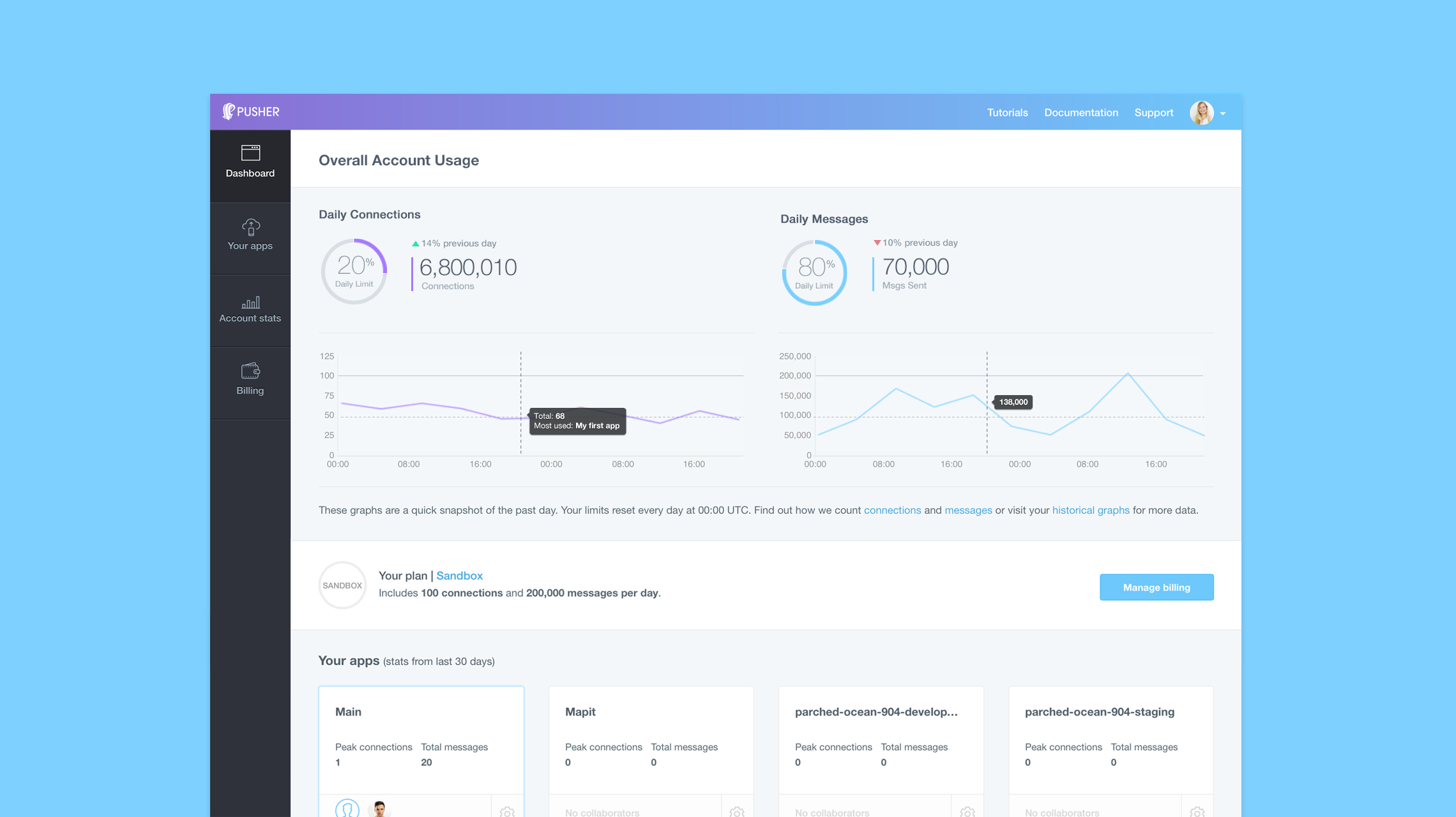
Pusher has thousands of customers around the world using their product, from developers at hackathons through to some of the largest companies, including ITV, The New York Times and Uber.
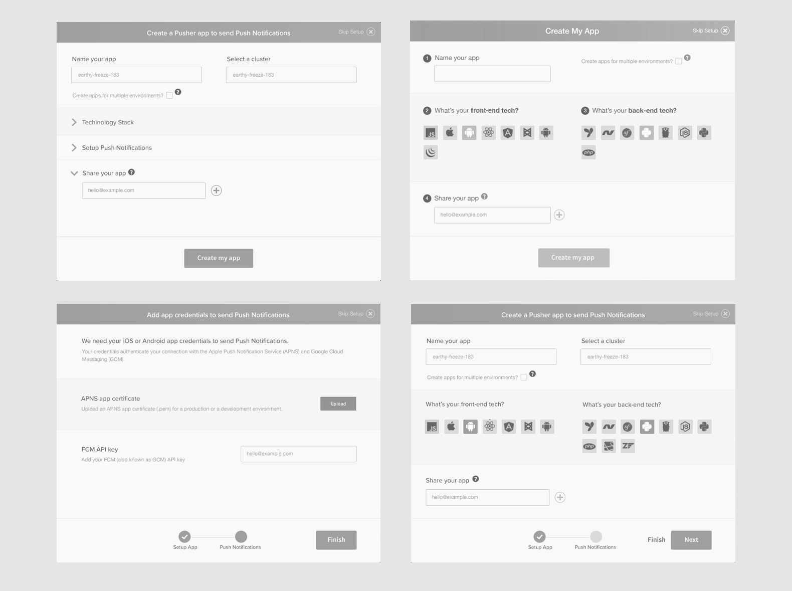
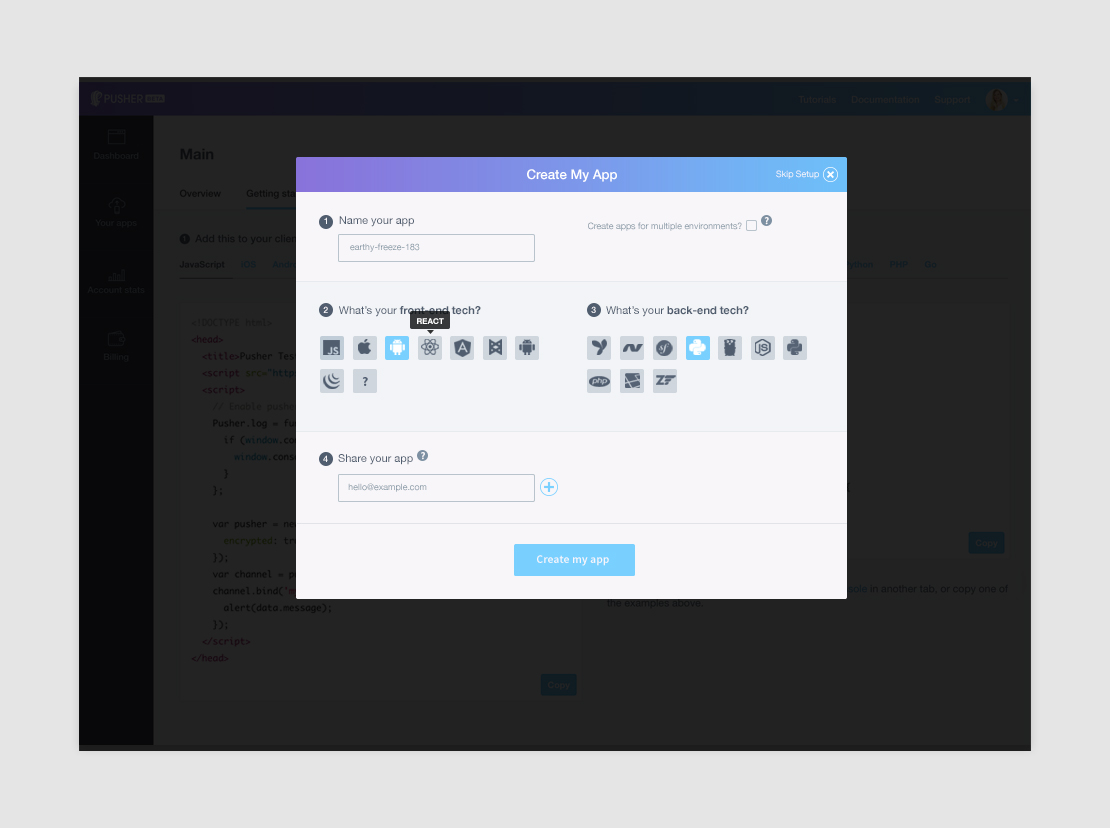
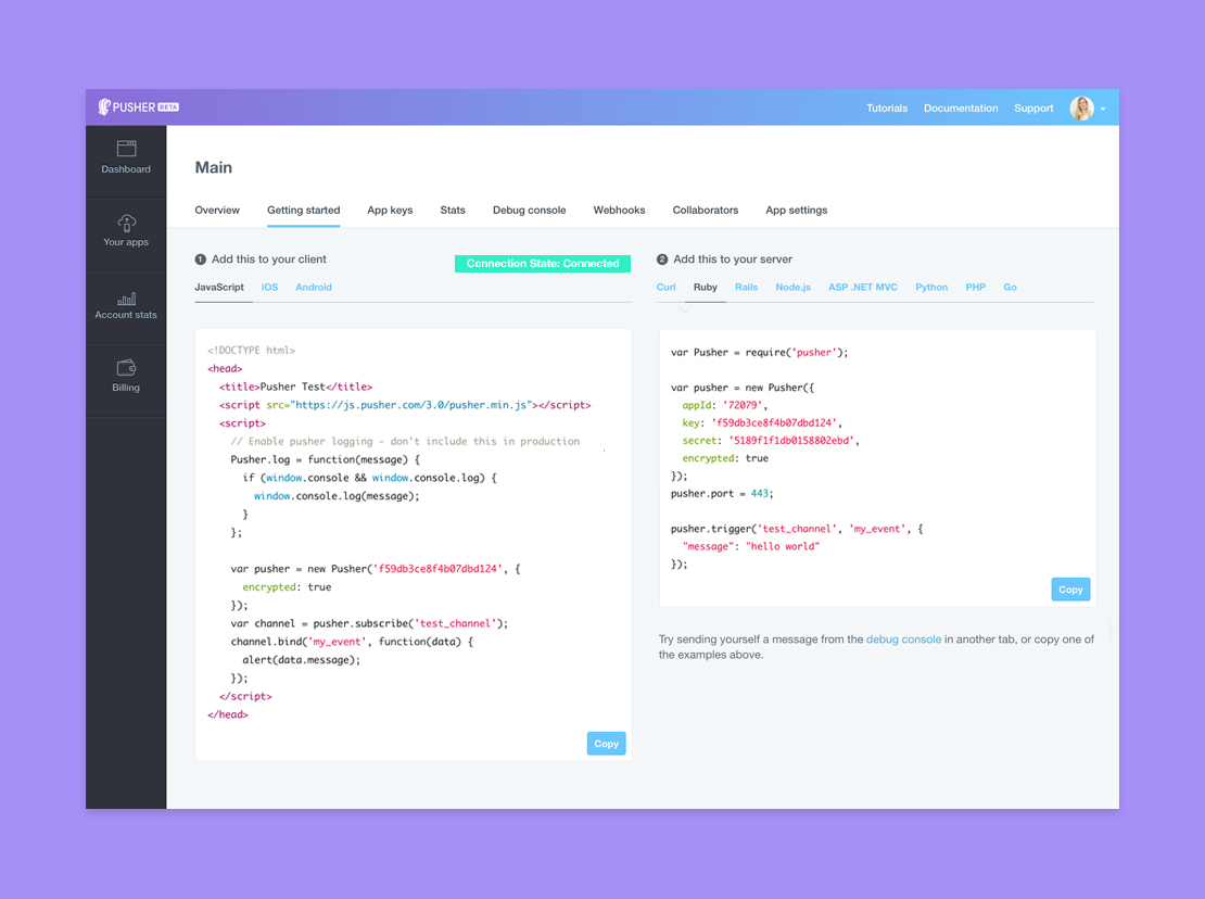
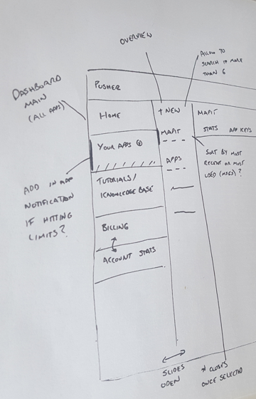
The Pusher dashboard had been slightly neglected over the years – some features had been added, but with minimal UX or UI consideration. By conducting a series of effective user tests, we realised the old dashboard was failing to deliver the value and ease-of-use our customers expected. From the feedback we gathered, users wanted to find key information about their account at a glance such as data usage, account levels and how usage had changed over time.
We developed the redesigned dashboard to deliver on our ethos of ease-of-use and simplicity, and the visual style of the new interface will be rolled out across more screens in the product over time.